eScapegoat - “One site to rule them all"
An online festive confession website.


Role: Creating Responsive Parallax HTML5 website using PSD mockups provided by G-dcast Team.

WORKFLOW & COMMUNICATION
Team G-dcast is located in San Francisco, US. We were approximately 13 hours apart. This was never a problem because Jeremy Shuback, the Project Manager made sure everything from their end was super clear. I made sure that I was on the same page with them in terms of Features and Interactions for the website. We used series of unlisted YouTube videos and Skype for communication.
FEATURES
Responsive Web Design
The website can be scaled to every possible Desktop and Mobile device resolution.Incidentally, the website works seamlessly on smart TVs as well. A warning appears when the browser window too narrow or too wide.
Custom CSS Layout Grid
No frameworks were used for creating layouts. Every piece of CSS code is optimized and hand-coded.
Graceful degradation
A fallback for every SVG image is provided with an intention to support all the browsers. During the time of development, support for SVG was limited.
Front-End UX
A user can navigate through the screens using either scroll, arrow keys or the buttons on right. One of the core features of the website, confessions text box has taken some inspiration from Twitter's Tweet box. This textarea includes a word counter and incase the user has exceeded maximum number of words allowed, a negative word counter. Also, Pressing esc key while entering text clears the textarea.
Sprite-based canvas animation
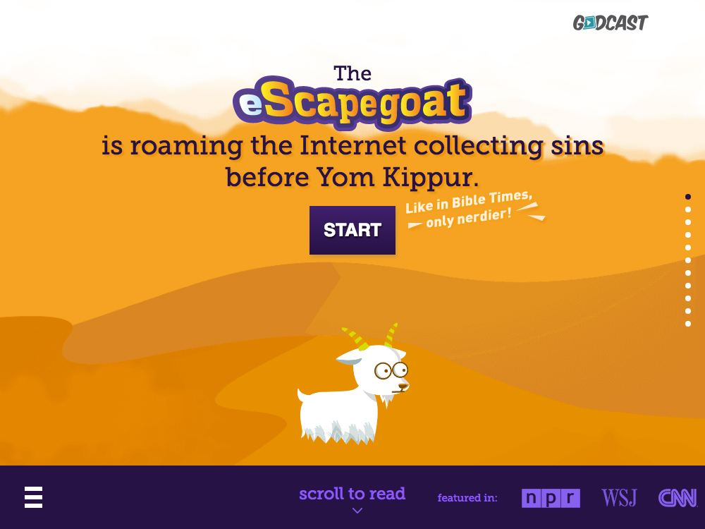
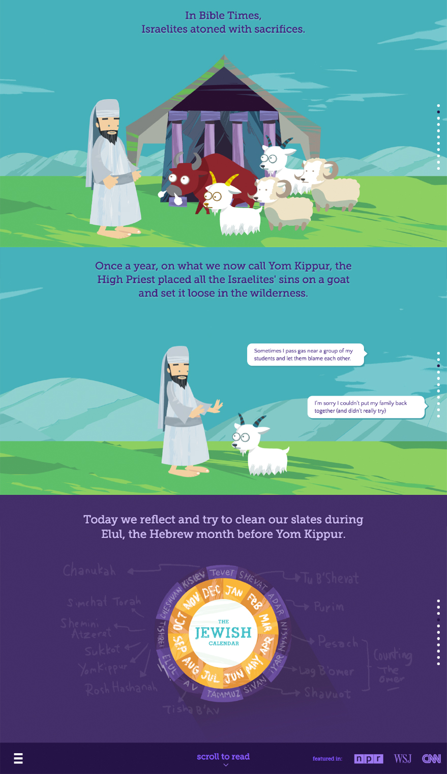
The sprite-based & panning-effect animation on the home page and above screen was developed using custom CSS3 and JavaScript Code.
OPTIMIZING PERFORMANCE
SVG Image Performance
We were keen on utilizing the power of SVGs as images for the website. Due to highly detailed vectors, the SVG exports went up to 12MB. I helped designer Madelyn Lee to achieve an optimized version of the vectors without loosing visual details. The result was a much more optimized vector file which in turn, exported smaller SVGs.
This was achieved by combining paths using pathfinder, simplifying paths, removing groups, removing completely transparent or hidden objects/layers, etc. SVGs were further minified and optimized using SVGO. Finally we reached a stage where the whole website size (including CSS, JS and images) was approximately 2MB.
Mobile Performance
We disabled Parallax in favor of performance for mobile devices. We realized that having parallax meant lower scrolling performance and higher page sizes caused by loading multiple images as parallax layers. The code makes sure that desktop images are not loaded on the mobile and vice versa.
Setting up Expires Header & g-zipping Content
I made sure that the server team is setting up the “expires headers” and enabling g-zip for faster performance.
Although, this is a one page website, the code is optimized to use the least amount of DOM elements possible for achieving all the features.
-
AG Event
A highly interactive single-page HTML5 Website for an Event company based in Istanbul, Turkey. Read More
-
My Portfolio Website
From Critical Rendering Path to Responsive Images, this website was created to achieve the best possible rendering and perfomance. Read More
-
Croma - My Dream Home
An Interactive HTML5 Based Catalogue for a Reputed Electronics Store in India. Read More
© 2020, All rights reserved.