Smashing Book 5 - Real-Life Responsive Web Design : Book Review

One of the first websites that I recommend to every novice front-end developer is Smashing Magazine. The website releases a series of books by the name "Smashing Book" and this post reviews the most recent edition, "Smashing Book 5". The theme of the book revolves around making well crafted responsive websites through the best processes, tools, workflows and practices laid down by Industry's well-known and respected Designers & Developers. The book helps in proposing ideas to develop high quality websites by optimising performance, using responsive images and resolution-independent assets, building a better front-end architecture, etc. It's handbook with practical guidelines and precise pointers that help in addressing most of the complexity involved in developing responsive websites.
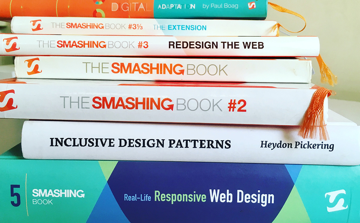
The paper quality is excellent and each page is printed on a non-glossy paper. The matte finish pages ensure that the reading is glare-free. The book is heavily illustrated with colourful illustrations and images. The form factor is further embraced with a sleek orange Bookmark and a hard-cover. These factors make this massive 584-page book a pleasure to read. All the pre-ordered books received a friendly "Thank You" card along with their name being printed as a part of ASCII art. I was one of the lucky ones to have my name printed on ASCII art (it appears on the first line, of the left page, last one towards the right). Each print order for the book also includes e-book in all popular formats; viz pdf, epub & mobi.


The book contains series of chapters written as long essays and these chapters can be read in non-linear way. To be honest, it's a huge book and I have only read a couple of chapters from the book. The post follows along some of the key points and learnings from some of these chapters.
Mastering SVG For RWD and Beyond
Sara Soueidan
Rating: 10/10
SVG is an XML-based Image format that can be used in various ways to embed vector artwork on our websites. These shapes and images are accessible and can be animated and made interactive. Because they are XML-based, SVG tend to contain many repeated fragments of text, which makes them a perfect candidate for lossless data compression algorithms. Sara Soueidan, an SVG expert from Lebanon cleverly explains all the techniques to seamlessly implement SVGs in Responsive-Workflow. This was one of my most anticipated chapters in the book and it completely lived up to its expectations. This is the first chapter I read and it served some of the initial guidelines while developing my portfolio website.

Embedding SVGs
Sara explains following ways of embedding SVGs.
As an image using the <img> element
<img src="mySVG.svg" alt="" />
As a background image in CSS
.el {background-image: url(mySVG.svg);}
As an object using the <object> element
<object type="image/svg+xml" data="mySVG.svg">
    <!-- fallback here -->
</object>
As an iframe using an <iframe> element
<iframe src="mySVG.svg">
    <!-- fallback here -->
</iframe>
Using the <embed> element
<embed type="image/svg+xml" src="mySVG.svg" />
Inline using the <svg> element:
<svg version="1.1" xmlns="http://www.w3.org/2000/svg" … >
<!-- svg content -->
</svg>
Key Points
- SVGs are preferred format for images like interface logos, icons, and vector-based illustrations
- Use of Glows & other complex graphical effects have been proven to affect performance in most of the browsers and they should be avoided in SVGs
- Complex SVGs containing a lot of paths and details can sometimes have larger file sizes and in such cases, using PNG instead of SVG could be a better alternative
- Having too many decimal places for point coordinates may bloat the file size of SVGs.
- Presentation styles (like fills & strokes) are added on SVGs using either CSS Classes or Attributes. In most of the cases, it is preferred to use CSS Classes instead of Attributes.
- Converting text to outlines in SVG makes the text unsearchable by search-engines and inaccessible by assistive technologies.
- We can optimise the output of SVG by Combining & simplifying paths in vector editing software like Adobe Illustrator.
- SVGO helps in reducing and optimizing SVG files. It also has a grunt plugin.
- If you embed your SVG inline in an HTML5 document, the
xmlnsattribute is not required. - SVGs embedded as images (using an
<img>tag or using CSS background property) cannot be animated or made interactive with the use of JavaScript. - The
<object>,<iframe>, and<embed>elements require CSS animations and interactions to be defined inside the<svg>because styles do not apply across documents. - An SVG embedded inline can be interacted and animated no matter where the animations and interactions are defined.
- We should use SVGs instead of Icon fonts.
- If you embed the SVG using
<iframe>, most of the browsers will set the size of the iframe to the default size of replaced elements in CSS: 300x150px. The only way to make an iframe responsive is by using the padding hack pioneered by Thierry Koblentz. It uses a similar CSS:
/*
Suppose the image/iframe/SVG is having an aspect ratio (width:height ratio) of 2:1, we would use a "padding-bottom" of 50%.
*/

.wrapper-with-intrinsic-ratio {
	position: relative;
	width: 100%;
	padding-bottom: 50%;
	height: 0;
}

.element-to-stretch {
	position: absolute;
	top: 0;
	left: 0;
	width: 100%;
	height: 100%;
	background: teal;
}
Sara filled the gap of not mentioning anything on SVG-Animations during her conference Talk at FFConf 2015.

Building Responsive Components With Flexbox
Zoe M. Gillenwater
Rating: 8/10
Flexbox is one of the most interesting ways of achieving responsive & liquid layouts using only simple CSS properties. Flexbox makes it so much easy to do layouts which previously required JavaScript and complicated CSS. With its power, comes its complexity.
Zoe has done a really good job of visually explaining how the Flexbox module works covering most of the topics namely axis/cross-axis,flex-grow,flex-shrink, etc.
I feel, instead of introducing a flexbox CSS property one by one, Zoe could have used a real-case scenario in which something had to be built using Flexbox. Then, each property added/modified could have iterated the design. This could have facilitated a better understanding of the topic and would have shed some light on practical use cases.


Using Responsive Images, Today
Yoav Weiss
Rating: 7/10
Responsive Web Design is based on three pillars: media queries, fluid grids, and flexible images. This chapter discusses the problem of efficiently loading the appropriately sized content images that fit the page’s design. The emphasis here should be on “efficiently”. More than anything else, the responsive images problem is a performance issue. We want to load high-density images on high-resolution devices, and load images with larger dimensions on devices with wide viewports that need them; but just as importantly, we want to avoid the download of these images on devices that do not need them. We also want to do all that without introducing delays to the image download process, so as to not introduce regressions at page-load time.
Key Points:
Fixed-width images
<img    src="sketch_500px.jpg"
        srcset="sketch_750px.jpg 1.5x, sketch_1000px.jpg 2x, sketch_1500px.jpg 3x"
        width="500" alt="Sketch With Material Design">
This is just like the good-old <img> element, with the addition of the srcset attribute. Inside srcset, all we do is give browsers a comma-separated list of resources and their x descriptors (describing the image’s pixel density), and the browsers pick the best fit, by matching these values with the screen’s DPR.
Variable-width images
In most of the scenarios, the image width is not fixed and varies as per the width of browser/viewport. Reson for doing so is that the same image will be served for viewports of size 1920px and 320px (since the condition is based on pixel density and not viewport size). The pixel density of browsers could be the same and we might end up making significant UX compromises, either on blurriness or on load speed.
If we want the browser to download the right resource, we need to provide it with a hint regarding the final display dimensions — there’s just no way around that. Depending on our design, the image’s dimensions can vary at the various layouts. One way this could be achieved is by using following code:
<img src="panda_fallback.jpg"
    srcset="  panda_360.jpg 360w,
              panda_540.jpg 540w,
              panda_720.jpg 720w,
              panda_1080.jpg 1080w,
              panda_2160.jpg 2160w,
              panda_3240.jpg 3240w"
     alt="A panda eating bamboo.">
The w in above code refers to the actual width of the image in pixels. This is the image's real size, which can be found by inspecting the image file on your computer (for example on a Mac you can select the image in Finder, and press Cmd + I to bring up the info screen).
But, the above use case would only fit in places where image width is 100% of the viewport. In places where image width is not equal to 100% of the viewport, an attribute of sizes can be added and the markup can be as follows:
<img
    src="thumb.jpg"
    sizes=" (min-width: 1200px) 235px,
            (min-width: 641px) 24vw,
            (min-width: 470px) 235px,
            50vw"
    srcset="thumb100.jpg 100w,
            thumb200.jpg 200w,
            thumb235.jpg 235w,
            thumb300.jpg 300w,
            thumb470.jpg 470w"
    alt="img desc">
Browsers can then use the resource density, along with the screen’s DPR (and possibly other factors), to figure out which resource would be the best to download and display.
Assuming we’re running with a browser viewport of 1,320 pixels, the browser will go over the sizes pairs and pick the first one: (min-width: 1200px) 235px. If the DPR value is 1, it will likely try to download the resource closest to 235 pixels and it would end up downloading thumb235.jpg. If the DPR value is 2, in order to match the screen’s density the required resource needs to be twice as large, so the browser will probably download the resource closest to 470 pixels, which is thumb470.jpg.
If our viewport is 660px wide, the (min-width: 641px) 24vw pair matches, and the image is likely to take up slightly less than a quarter of the viewport’s width. That means browsers will try to download the image that’s closest to 158px wide for a DPR value of 1, and closest to 317px wide for a DPR value of 2. The actual resource picked is likely to be different here between browsers, since there’s no exact match. In Chrome, the picked resource for the first case would probably be thumb200.jpg, and for the second case, the picked resource would probably be thumb300.jpg.
Counting Stars: Creativity Over Predictability In RWD
Andrew Clarke
Rating: 7/10
Key Message
Develop Ideas, Do not get involved in the process too early, innovate and look forward to ways to break the convention once a while. Create memorable experiences, get inspired by the Ad Industry. Emotional appeal is as important as functional abilities. Make sure the specifications, personas, user stories or wireframes serve as mere guidelines and inform and not dictate the solution. Approaching the project this way will encourage a process that's respectful to everyone, be creatively fruitful and, above all, successful.
In Detail
Creation of Website has become so complex in recent times, that it not only includes designers and developers; it also includes researchers, scientists, and user experience professionals. When we visit a website, we expect it to be technically proficient, easy to use and be able to find an information quickly through a well-designed interface. The Web is more accessible, flexible and responsive to users’ needs as well as to devices of all kinds. Much of this can be credited to the clever processes that designers and developers have created. These help in accelerating the time it takes to develop and design while validating the decisions made.
While we focus our thoughts on processes, methods, and mechanics for making the web more responsive, instead of on ideas, we’re losing the creative soul of our work. Designs lack energy and spontaneity because we’re thinking too early and then too often about the consequences of failure. We’re creating the web that’s full of safe designs because we’re driven by the need in some of us for predictability, reliability, and repeatability. We’re creating the web where design rarely dares to stray beyond the boundaries of established conventions.
The chapter's title has been inspired by a quote by Mad Men's Don Draper. It’s from an episode called ‘The Monolith’ in season seven, set in 1968. Don was told that “the IBM 360 (computer) can count more stars in a day than we can in a lifetime,” and he replied, “But what man laid on his back counting stars and thought about a number?” . It’s important to remember that creativity can never be — almost by definition should never be — as predictable as manufacturing. We can’t and we shouldn’t attempt to rationalise creativity by turning it into a process.
Ideas
“Ideas are the building blocks of creativity. Whatever you create, from writing to filmmaking to painting to composing, you start with an idea. Without one you have nothing.”
-John Hegarty,Hegarty on Advertising
Too often brilliant ideas get extinguished because people think about practicalities too early. How will this be built? How can we make it responsive? How will someone use it? These are important questions, at the right time. Naturally, some ideas will fade, but others will dazzle. Before we pinch out the flickering flame of a new idea, let it burn brightly for a while longer, unhindered by practicalities.
One must never forget that it’s ideas that matter most, without them, there would be nothing. You can’t turn a poor idea into a brilliant one by iterating. That instead of having fewer ideas, we must make more.
In 2014, Two renounced designers, Cennydd Bowles & Andrew Clarke shared an open letter to junior designers. Cennydd Bowles addresses a conservative approach taking into consideration practicalities while ideating. Whereas, Andrew Clarke takes completely a different approach where he talks about ideating and iterating as often as possible.
Your mind is a muscle, just like any other: you need to use it to keep it in top condition. To keep making ideas happen, make more of them, more often. Feed your mind with inspiration wherever you can find it. Exercise it with play. Make idea after idea until making them becomes a reflex.
-Andrew Clarke
My take on this
I personally feel that there should be a balanced mixture of both, the conventions and innovation. We should also frequently ideate, question & find newer perspectives of looking at common conventions.
In spite of having a nicely designed responsive website that works across browsers and devices, if the content structure of the site is not in shape, it can degrade the user experience of the website. Setting up some guidelines and rules facilitating a proper content strategy does not stop us from being a good designer or developer, but having a badly designed structure would make our job hard and prevent us from giving an utmost best for your work.
We sometimes forget that the end users of our website can also be content-writers, admins and authors. Content Strategy helps them to get their task done by assisting them to add content as if they were filling out a form instead of expecting them to start from scratch.
Structured Content is breaking down information and content into bits and pieces and storing them in individual fields of a CMS instead of encompassing them in fewer fields.
Key Points
- Breaking content down and storing it as individual components
helps a designer's ability to direct content quality - The labels and text fields should be properly communicated and appropriate helper classes should be added so that the authors can understand and interpret them correctly. For instance, using
Artist NameandBiographyis much better than using labels likenameandbody. Same thing applies to error messages. - Structured Content also helps in reusing the information in other channels. If we are creating a 100-character version of the headline for display on a small screen, the same headline can be used for twitter or shown on a smart-watch or a micro-screen.
- Everyone from developers to authors, to stakeholders look at data from their own perspective. While authors would want to know the technicalities like character limit, required fields, etc; stakeholders want only a high level/big picture of content and what structure allows them to do. Developers should be given more context and technicalities like a drop-down, type (boolean, text, etc), number of instances, etc. A spreadsheet is often the best place to keep a track of all these pieces of the content model.
- While redesigning a website, often the strategy for adding/removing content could be derived from customer service team and analytics.
This chapter was quite insightful for me during the development phase of a production house's website (That is still work in progress) as it cleverly shows better ways to mark down and create consistency in output for a responsive website.
Content Strategy is all about progress, not perfection.
Wishlist for Smashing Book 6
I expect the next Smashing Book to be published in next year and here are some of my wishlist (if the "Smashing Magazine Team" ever come across this article):
- I would want the new book to start where this book left off. It would be safe to exclude tips, technique mentioned in this book.
- Not be framework specific (Rather focus on industry in general).
- Continue the legacy of having a high-quality print/hardbound book
- Some topics dedicated primarily to Web Animations.
- Some case studies from their new design
Verdict

If you are someone who designs and/or develops responsive websites, this is one of the most indispensable books you can have on your bookshelf. The book contains detailed information on topics like Flexbox, SVG, Responsive Pattern and processes, Responsive Images, Responsive Workflow, Designing for Responsive Websites, and pretty much everything related to responsive design. Although it was published in 2016, the book still holds solutions to problems we face today.
I really liked that this book isn't a framework-specific book and focuses on Web Design and Responsive websites in a way that the learnings can be applied in any manner to a framework/library.
The book can be bought from Smashing Store.