How I made an Interactive, Scroll-Animations website load in less than 3 seconds!

This week I launched one of my most anticipated project, my portfolio website. This post covers some of the Progressive Enhancement, CSS3, HTML5, Responsive Web Design tips and tricks involved while developing and strategizing the website.
*\*The website file size is merely* **300kb** *& loads within 3 seconds, (on most of the networks)* 😎
Note: This post is primarily written to share some of my learnings as a Front-end developer and anyone working as a website designer or a developer can follow along.
Visit Website
(Alternatively, you can watch the following video and skip the post)
Design
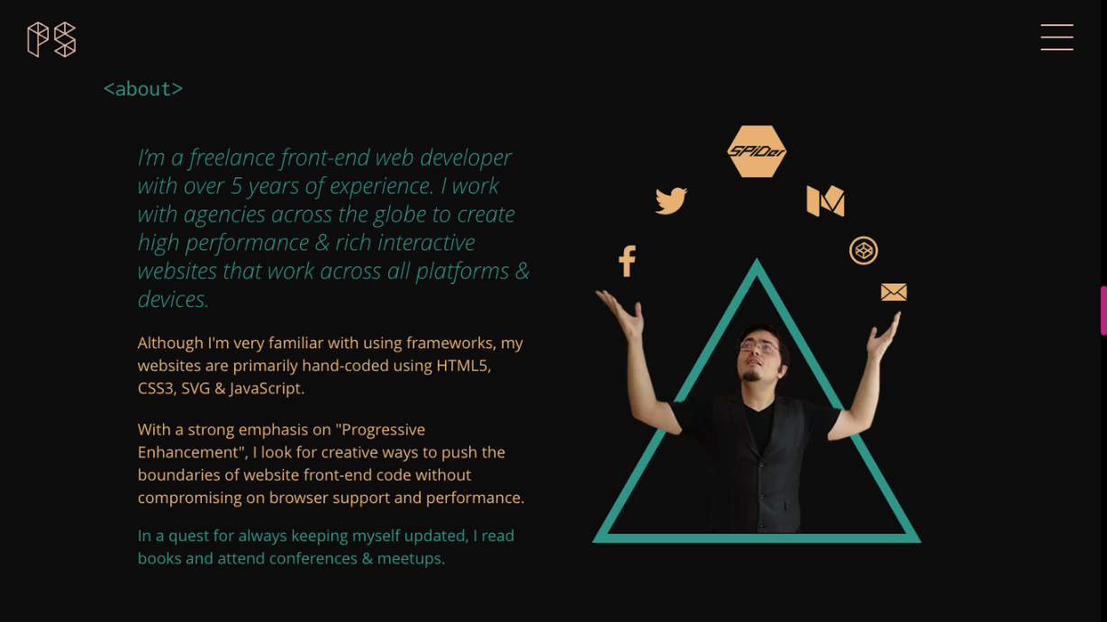
When I gave my first design brief to Mythili Hariharan, the designer of this website; I was very clear on a couple of things.
- I needed a dark themed website
- I need the website to showcase my ability to create interactive experiences on the web.
- Every design element had to be generated via code as I needed a website that has a very small file size and loads within 3 seconds.
I wanted a black themed website since a lot of portfolio website these days have a white background and I wanted to break this convention. Also, I love the fact that having a dark theme for the site has given it a very cosmic and a tech feel to it.
Every section heading is accompanied by opening and closing angular brackets and the content within is indented to symbolise the structure of HTML tags inside a code-editor.
Mythili has done an excellent job in fulfilling the design requirements for the website. So, Bravo Mythili!!
Critical Rendering Path
In terms of code, one of the first things I would like to speak about is "Critical Rendering Path". In a nutshell, it talks about progressively loading the content, keeping the first priority on the "critical", the "first-paint" or "above the fold" content. For instance, instead of having all the content in 1.5 seconds as this picture depicts, it's a better practice to load the critical content within 0.3 seconds.
For me, the critical content was the preloader logo and I have lazyloaded CSS, JavaScript and any asset that comes in the way of rendering it on the screen. In most of the cases, you would see the first paint happening in anytime within a second and an overall website load within 5 seconds.
You can learn more on "Critical Rendering Path" through this free video course on Udacity.
I have used a clever way to load my non-critical CSS with a technique described by Scott Jehl from the Filament group. While developing a lazyloading CSS library, he developed this technique. He experimented and made a strong observation on placement tags of CSS files.
- For the first experiment, He used an HTML file containing a link to CSS file which comes just before the closing tag. This technique is quite similar to one that involves calling JavaScript files at the end of the page,
- In the second technique, He placed a dummy "media" attribute on the CSS file and then this attribute was dynamically changed through JavaScript.
He found that the second technique was better in terms of the load time. So, I have used the second technique and you can know more about this technique and his findings by heading over to this link.
Performance
The next thing I would like to talk about is the performance. I have made sure that every single line of code added to the website has some functionality and the overall file size of the website has been kept as minimum as possible. The website is primarily hand-coded without any use of a framework like bootstrap. Although I have nothing against bootstrap, I feel it's a wrong tool for a website like this, which has a custom grid and an unconventional layout.
Unlike most of the responsive websites which focus on making the desktop website work on a mobile device, I have used a mobile-first approach where in every single bite transferred counts. A lot of people still access the content through 3G and in spite of price for internet, in general, has reduced over the years, I feel it's every developer's responsibility to optimise as much as possible.
The website file size less than 300kb. And just to give you a context how small this figure is, here is an article by SitePoint that was published last year that points out that average web page is around 2.2mb. As of the publish date of this article, the average file size is 2.4mb. So, in spite of being an interactive, scroll-heavy website; I have managed to pull the size down to roughly 300kb.

Rendering Performance
The browser screens refresh at 60 Frames per second. Thus, it's ideal that for us to optimise our animations and the scrolling at 60 FPS. Pages should not only load quickly, but also run well; scrolling should be stick-to-finger fast, and animations and interactions should be silky smooth. The website uses a lot of code and to be honest, and optimising for 60FPS is sometimes very difficult for a creative website like this. But, nevertheless one way this could be achieved is to know how browsers render and paint the content and this blog post by Paul Lewis talks in detail how this could be achieved.
CSS Triggers is a useful website when it comes to optimising rendering performance as it shows a tabular information of the steps taken by browsers while they go through animating a CSS property.
Ideally, while animating an element we should use opacity and transforms more than any other property.
The property will-change is quite a controversial one as sometimes it rasterises the elements while animating. I chose to use the property very carefully and I would advise anyone planning to use this property to go through this article by Greensock.
Semantically validated HTML
While 100% validation is practically not possible for any website, I have made sure most of the content is as much validated as possible. Why validate at the first place? I had shared my views on HTML5 Validation as a medium.com post.
Exclusion of Scroll-hijacking
Websites are made for users and each design choice should be made to benefit the user. A lot of the websites these days use scroll hijacking, a technique that controls the scrolling behaviour and/or the speed of user scrolls. I was always against taking the control of scrollbar from the users as I feel it's an anti-pattern and should be avoided in most cases. Envato has a great post on this.
Also, I avoided using a JavaScript scrollbar and used CSS-scrollbar instead.
Accessibility
Accessibility is taken deeply into consideration while developing this website. Heydon Pickering released a book on Accessibility and I have reviewed the book earlier on my blog. Nevertheless, it is one of the best resources to get familiar with accessibility whether you are a designer or a developer.
NO-JS
Although JavaScript is enabled on most of the devices, I have made sure that most of the content is as much accessible to browsers and devices which don't have JavaScript enabled.
SVG
Most of the creative code that you see on the website is done using SVG, which is an XML- based image format. Whether its accessibility, scalability, file size or browser support, SVG is currently one of the best front-end technologies that could be used for vector elements. To get familiar with SVG, I would recommend 2 books.
- "Practical SVG", by Chris Coyer
- and Smashing book 5, Sara Soueidan has written an extensive 80-page chapter in Smashing book 5.
Most of the SVG DOM manipulations are managed with SnapSVG, an open-source javaScript library.
Animations
All the animations are managed with Greensock and the scroll animations are triggered by ScrollMagic, a very optimised library for scrolling animations.
Although initially I was tempted to use SMIL for SVG Animations, which is the native specification for SVG Animations. But, I did not use SMIL and instead used SnapSVG and Greenock. One of the primary reasons for doing so was that it was deprecated by most of the browsers and thus, it did not seem to be an ideal choice for SVG animations. Sarah Drasner has written an amazing post on CSS tricks for SMIL alternatives.

WebP
The raster images format WebP has been quite popular in the recent times because of low file size. In spite of being only supported in Google Chrome and Opera, I choose to use webP images with a fallback. The reduction in file size, in most of the cases, was anywhere between 40% to 70%.
I used a mac app, Webponize to convert my images.
Stu, one of the contributors of modernizr has written a detailed post on how we could do so on his blog. If you want to to know more about WebP, please check out the link on google developers website.
History
All the projects transitions are handled via Ajax and it's absolutely essential for any ajax website to have friendly shareable links. So, on everytime a user visits any of my case studies, I manipulate the browser history using a custom JavaScript that takes the advantage of History API. I did not use any polyfill for this as this is very very well supported in most of the browsers.
Chrome Frame
Google Chrome Frame was a plugin for Internet Explorer that enabled rendering the full browser canvas using Google Chrome’s rendering engine. But the project was shut down in 2014 and google ceased the support for the same. Unfortunately, not many websites have removed the meta tag for chrome-frame. This along with several other redundant code snippets are not a part of the website.
Thanks for following along, please do share and leave your comment.